Come check us out at our new home!

Thursday, February 28, 2013
Thursday, February 21, 2013
Bye, Bye Bi-Folds
One of the saddest places in our apartment is definitely the closet. As in, the only closet in the bedroom and the only full-sized closet in the whole place (the coat closet upstairs is one of those narrow things where the coat hangers don't even fit in the entire way). It's a regular-sized closet, I guess, but compared with the huge closet we had in our apartment last year, it just doesn't cut it. Not only is it pretty small, but it's stuffed to the gills with out-of-season clothes, Christmas decorations and other random goodies, mostly packed into hideous plastic storage bins.


Even more annoyingly, we aren't even able to access the full space because of the doors. They're the standard rental bi-fold doors and even when they're fully open, they block access to the back corners of the closet. Also, because they fold out, we weren't able to use the backs of the doors to hang shoe racks or anything like that. Basically, we were stuck with a small closet and an even smaller array of available options to increase storage and functionality.

While browsing on Pinterest this week, I came across this little gem on Apartment Therapy and decided to try it out. In total, the project took about 30 minutes and cost me $8 for the mending braces. I didn't buy the wood or the magnetic contraption because my local hardware store didn't have what I needed. And now, after finishing the project, I'm not so sure that I need them.
To start, I had to get the doors off their rolling tracks. On top of the door (I had to stand on a chair to do this part), I pushed down on the little wheel mechanism that was closest to where the doors opened. My closet doors had two little rolling things (as you can tell, my technical terminology is excellent), but I only need to take out one on each door - the one closest to the center.

After the doors were pulled out, I had to remove the mechanism completely so that the doors could close after I was finished.

Then, I simply drilled and screwed the mending braces into place. I put one at the top of the door, one towards the middle and one towards the bottom. This was really simple to do, but just make sure the door is completely flat when you're working (I used my foot and a laundry bin to keep it in place).


After finishing both doors, I had to remove this little locking mechanism on the bottom of both doors (but I forgot to take a picture) and then, I was done! The closet now looks SO much bigger, I can't even believe it. After a little rearranging of all our stuff - it's great being able to access every corner of the closet - things are shaping up. While I'm by no means done with the close reorganization, this is a great start.

In addition to making a world of difference in storage space and looks, this is a great, easy project for renters because it's completely reversible. When we eventually move out, it'll be incredibly simple to reinstall everything I took off and to remove everything I added. Just remember to save the hardware that you take off - I always put mine in plastic bags and label them.
Now, it's time to start thinking organization systems!

Hey, now that doesn't look so bad, does it?

Wrong!

It would be nice to be able to actually see the shoes in my shoe rack...
While browsing on Pinterest this week, I came across this little gem on Apartment Therapy and decided to try it out. In total, the project took about 30 minutes and cost me $8 for the mending braces. I didn't buy the wood or the magnetic contraption because my local hardware store didn't have what I needed. And now, after finishing the project, I'm not so sure that I need them.
To start, I had to get the doors off their rolling tracks. On top of the door (I had to stand on a chair to do this part), I pushed down on the little wheel mechanism that was closest to where the doors opened. My closet doors had two little rolling things (as you can tell, my technical terminology is excellent), but I only need to take out one on each door - the one closest to the center.

It already looks so much bigger!
After the doors were pulled out, I had to remove the mechanism completely so that the doors could close after I was finished.

I just tightened a wrench around it and pulled - it came right out.
Then, I simply drilled and screwed the mending braces into place. I put one at the top of the door, one towards the middle and one towards the bottom. This was really simple to do, but just make sure the door is completely flat when you're working (I used my foot and a laundry bin to keep it in place).

One of the braces screwed in place

The first door all finished.

It's like a whole new closet!
In addition to making a world of difference in storage space and looks, this is a great, easy project for renters because it's completely reversible. When we eventually move out, it'll be incredibly simple to reinstall everything I took off and to remove everything I added. Just remember to save the hardware that you take off - I always put mine in plastic bags and label them.
Now, it's time to start thinking organization systems!
Tuesday, February 19, 2013
The Evolution of the Bathroom
If there is one room in our apartment that I don't like, it's the bathroom. It's tiny, the tile is gross and has absolutely no storage space - not even room for a trash can! Besides the measly little vanity, when we moved in, the only room to put anything was this pathetic little wire rack mounted over the toilet.


Have you ever seen a sadder bathroom?
Since then, the bathroom has continued to haunt my dreams (OK, not literally) and I have managed to make a few minor changes that have made a world of difference. First, I replaced the knobs on the vanity with these gorgeous ones from Anthropologie. I wanted to buy a bunch of them to replace the gross, gold hardware in my kitchen, but at $8 a pop, that just wasn't going to happen.

While the knobs made me feel a little better in the morning, they certainly didn't change the scratched up, dirty look of the vanity cabinets.

An over-the-toilet storage rack also helped - as did a new (from our previous apartment) shower curtain and bath mat, but still, I knew the room had a lot of work to do...and a lot more potential.

A couple of months later, I replaced the shower curtain with this one from Target, as well as a new bath mat (also from my favorite low-budget store). With some baskets from TJ Maxx and Ikea, it was finally a functional space.

I had to stand in the shower to get this shot.
After adding an over-the-door hook and a little artwork (thank you, Ansel Adams and my mom), the place does what it's supposed to.

Though storage has been enhanced, it still doesn't look great, and I have a lot of plans for the future of this room...including one simple solution that I worked on tonight.
Stay tuned!
Framed Paw Print
As you may have realized from reading my blog, I am slightly obsessed with my dog. And by slightly, I mean immensely. The love/obsession I have for Olive may even go a little bit overboard - a feeling that I am starting to agree with based on my latest project.
.JPG)
For Valentine's Day, I wanted to give my boyfriend something that would be both sentimental and meaningful. I also wanted to give him something that we could use to decorate our apartment. While our interests can vary greatly (he's mostly into computers and other technology-related things), there is one thing we share a common love for - our puppy. While I could have just given him a nicely framed photo of Olive, or something along those lines, I knew I wanted to do something a little more creative and a little more unique. After some thinking, I thought it would be an adorable idea to frame a paw print from our favorite furry creature.
This project was both easy and quick - the actual "art" only took about 5 minutes to make, but let me tell you, it was a process. Next time, I would definitely think ahead in terms of implementation. What do I mean? I mean that an almost 2 year old dog is NOT going to happy about having its paw painted and then held for ransom while you hold it down on a piece of poster board. Luckily, I thought to have some pepperoni on me to entice my dog to sit still, but unluckily, I didn't think ahead quite enough. Let's just say I found myself with various paw-shaped stains on my rug (which, also luckily, came right out).
A word of advice: DO THIS PROJECT OUTSIDE, or at least, not next to your nice rug.
Anyway, back to the beginning.
After putting up my photo ledges and creating the perfect frame, I was ready to create some homemade (and free) art. To do this, all I needed was some poster board that I already had lying around, some black acrylic paint (also lying around the house), a paintbrush, some masking tape and a marker. Along with the pepperoni (highly recommended if your dog is crazy like mine) and Olive, I was set to go.
The first thing I had to do (besides woo Olive with treats) was paint the bottom of her paw. I decided to go with black paint, because I had it on hand and because I thought it would go with the black and white scheme I had going on. Painting Olive's paw went well - she was a little alarmed that I held onto her paw for so long, but she didn't seem to mind (although, to be fair, giving "paw" is Olive's favorite pastime). Next, I had to hold Olive's paw down on the poster board. This part, she didn't like, but it only took about 5 seconds. After I was done, I simply (carefully) lifted her paw off the poster board and voila! I was done! Now, this is where things got a little messy, but as long as you're more careful and thoughtful than I am, you should be all set.
After letting the print dry (and cleaning paint stains out of my rug), I had this slightly messy paw print. At first, I was kind of disappointed that it didn't come out as neatly as I had intended, but now, I love it even more. My dog is pretty much insane and this messy/crazy print certainly reflects her personality more than something perfect would have. Underneath the paw print, I labeled "Olive, February 2013" using a thin, felt-tip marker. I used pink to add a little splash of color and to illustrate that yes, our dog is a girl, despite my boyfriend's attempts to deny that fact.

The next day, I simply cut out the paw print and taped it to the back of the frame so it would be straight. After doing this, I realized I cut the print a little too small for the frame, so I just attached another, larger piece of poster board behind that to ensure there wouldn't be any gaps.

In total, the project took a combined 15 minutes (plus drying time) and I love the way it looks! My boyfriend also loved it and it really complements our photo ledge.

.JPG)
How could I NOT be obsessed with that face?
For Valentine's Day, I wanted to give my boyfriend something that would be both sentimental and meaningful. I also wanted to give him something that we could use to decorate our apartment. While our interests can vary greatly (he's mostly into computers and other technology-related things), there is one thing we share a common love for - our puppy. While I could have just given him a nicely framed photo of Olive, or something along those lines, I knew I wanted to do something a little more creative and a little more unique. After some thinking, I thought it would be an adorable idea to frame a paw print from our favorite furry creature.
This project was both easy and quick - the actual "art" only took about 5 minutes to make, but let me tell you, it was a process. Next time, I would definitely think ahead in terms of implementation. What do I mean? I mean that an almost 2 year old dog is NOT going to happy about having its paw painted and then held for ransom while you hold it down on a piece of poster board. Luckily, I thought to have some pepperoni on me to entice my dog to sit still, but unluckily, I didn't think ahead quite enough. Let's just say I found myself with various paw-shaped stains on my rug (which, also luckily, came right out).
A word of advice: DO THIS PROJECT OUTSIDE, or at least, not next to your nice rug.
Anyway, back to the beginning.
After putting up my photo ledges and creating the perfect frame, I was ready to create some homemade (and free) art. To do this, all I needed was some poster board that I already had lying around, some black acrylic paint (also lying around the house), a paintbrush, some masking tape and a marker. Along with the pepperoni (highly recommended if your dog is crazy like mine) and Olive, I was set to go.
The first thing I had to do (besides woo Olive with treats) was paint the bottom of her paw. I decided to go with black paint, because I had it on hand and because I thought it would go with the black and white scheme I had going on. Painting Olive's paw went well - she was a little alarmed that I held onto her paw for so long, but she didn't seem to mind (although, to be fair, giving "paw" is Olive's favorite pastime). Next, I had to hold Olive's paw down on the poster board. This part, she didn't like, but it only took about 5 seconds. After I was done, I simply (carefully) lifted her paw off the poster board and voila! I was done! Now, this is where things got a little messy, but as long as you're more careful and thoughtful than I am, you should be all set.
After letting the print dry (and cleaning paint stains out of my rug), I had this slightly messy paw print. At first, I was kind of disappointed that it didn't come out as neatly as I had intended, but now, I love it even more. My dog is pretty much insane and this messy/crazy print certainly reflects her personality more than something perfect would have. Underneath the paw print, I labeled "Olive, February 2013" using a thin, felt-tip marker. I used pink to add a little splash of color and to illustrate that yes, our dog is a girl, despite my boyfriend's attempts to deny that fact.

The next day, I simply cut out the paw print and taped it to the back of the frame so it would be straight. After doing this, I realized I cut the print a little too small for the frame, so I just attached another, larger piece of poster board behind that to ensure there wouldn't be any gaps.

Forgive the shadows - photography is not my thing.
In total, the project took a combined 15 minutes (plus drying time) and I love the way it looks! My boyfriend also loved it and it really complements our photo ledge.

The finished product.
Thursday, February 14, 2013
Picture Ledges
One thing I have always hated about our apartment is the big, ugly, white space above the TV. As you can see below, we had this huge wall with nothing on it - and a few quirky requirements.

First, our landlord specifically put into our lease that we're not allowed to hang the TV on the wall, so that original idea for taking up some wall space in our living room was out the window before we even moved in. Second, there's this hideous buzzer/speaker system right in the middle of the wall (OK, kind of to the left) that would have made it awkward to hang one large piece above the TV.
To start with, we had to get rid of our hideous old TV stand. I can't seem to find a picture of it, but it was just about the clunkiest, ugliest piece of furniture ever made. It was a relic from my boyfriend's childhood bedroom, so at least I don't have to be ashamed that I bought it, but I am a bit embarrassed I let it be the focal point of the living room for over a year. One day, over the summer, while at Ikea looking for something else, we found this Laiva TV stand, which at $20, was a no-brainer. It's simple, clean and it fits perfectly in our living room. While I liked the new TV stand, the white space above still gave me nightmares.
After many an afternoon on Pinterest and some of my favorite blogs, I came across this picture ledge from Yellow Brick Home. I am impressed that they not only made their picture ledge gorgeous, but they built it themselves. While I had dreams of renting power tools and working away up on my roof deck, the temperature outside and the viability of getting my hands on everything I needed made me think this wasn't going to happen. Instead, I took the easy way out and started looking online for affordable picture ledges that would do the trick.
As usual, I ended up on the Ikea website, where I found their Ribba picture ledges. They came in black, which was a plus, and they were cheap ($9.99 for the smaller one and $14.99 for the larger one). So, one day last week, I dragged my reluctant (but amazing) boyfriend on a shopping trip to Ikea to pick up the shelves and some picture frames.
.JPG)


That's tape on the walls - I was measuring to see if this would even work
First, our landlord specifically put into our lease that we're not allowed to hang the TV on the wall, so that original idea for taking up some wall space in our living room was out the window before we even moved in. Second, there's this hideous buzzer/speaker system right in the middle of the wall (OK, kind of to the left) that would have made it awkward to hang one large piece above the TV.
To start with, we had to get rid of our hideous old TV stand. I can't seem to find a picture of it, but it was just about the clunkiest, ugliest piece of furniture ever made. It was a relic from my boyfriend's childhood bedroom, so at least I don't have to be ashamed that I bought it, but I am a bit embarrassed I let it be the focal point of the living room for over a year. One day, over the summer, while at Ikea looking for something else, we found this Laiva TV stand, which at $20, was a no-brainer. It's simple, clean and it fits perfectly in our living room. While I liked the new TV stand, the white space above still gave me nightmares.
After many an afternoon on Pinterest and some of my favorite blogs, I came across this picture ledge from Yellow Brick Home. I am impressed that they not only made their picture ledge gorgeous, but they built it themselves. While I had dreams of renting power tools and working away up on my roof deck, the temperature outside and the viability of getting my hands on everything I needed made me think this wasn't going to happen. Instead, I took the easy way out and started looking online for affordable picture ledges that would do the trick.
As usual, I ended up on the Ikea website, where I found their Ribba picture ledges. They came in black, which was a plus, and they were cheap ($9.99 for the smaller one and $14.99 for the larger one). So, one day last week, I dragged my reluctant (but amazing) boyfriend on a shopping trip to Ikea to pick up the shelves and some picture frames.
.JPG)
Of course, I came home with more than just the ledges and the picture frames. What can I say? I have an Ikea problem.
Once we got home, hanging the ledges couldn't have been easier. Thanks to my trusty drill, an iPhone level app and my boyfriend's sheer brute strength (aka he held the shelves in place), we were able to hang the ledges in about 20 minutes. It couldn't have been easier, and again, if I can do it, anyone can. All you need is a drill and 5 screws to get this project done in no time.

Looking better already!
The next step, once the ledges were up, was to arrange the frames. I bought and re-used all black frames to keep things consistent. I've read it makes the most sense to either keep the shape or color of the frames the same, and for my first venture in photo ledging (yup, I said it), I decided to go simple. After a few moments of moving and rearranging things, we had this nice little setup. I bought the succulents at Ikea as well just because I loved them, but found they looked great keeping the picture frames company.

Some sad, lonely frames

That annoying little speaker contraption fits right in
Unfortunately, I didn't have the prints I wanted on hand, so I ordered some from Shutterfly from various places we had traveled, and of course, my dog. Also unfortunately, a blizzard decided to hit a couple of days later, and the mail delivery was much delayed. After a week of waiting, the prints finally arrived and the project is complete, minus one Valentine's Day gift that I'll be posting soon (so my boyfriend can't see it before I give it to him). But, you can see the nifty (and still empty) little burlap frame I made on the top shelf.

The (almost) finished project
I think it adds great definition to the previously blank wall and I'm excited to change the prints out as we go. What do you guys think? Do you think my choice to go all black and white is a little too boring?
Tuesday, February 12, 2013
Dresser Inspiration
While I've primarily stuck to the living room on this blog so far, it's because the bedroom needs a lot more work. Most of the bedroom/office is just plain embarrassing, and though there are a multitude of reasons why, one of the major yikes are the matching nightstand and dresser.
These two pieces (we used to have a matching desk as well) came from my younger sister's room back in New Hampshire. My little sister is the creative one in the family - she goes to writing school, she plays guitar and she's constantly doing art projects in her room. Needless to say, these art projects are also messy projects, and keeping her furniture in good condition was never really on her priorities list. So, last year, when my boyfriend and I desperately needed furniture for our first apartment, my mom jumped at the opportunity to replace the old, disgusting furniture in my sister's room by giving it away to us.
.jpg)
.jpg)
Lucky us, right? Well, actually, yes. Thanks, Mom, I really do appreciate it.
Soon after getting the furniture, I painted the knobs a simple black, which helped the look of the pieces a bit, but still left me bored and a little bit appalled.
While the pieces may not look the best, they serve their purpose, and structurally, they're in fine condition. So, rather than running out to buy a new dresser and nightstand, I want to re-purpose what I already have.
This weekend, for Valentine's Day, my boyfriend and I are going to his family's beach house in Rhode Island. While I'm excited to get away, I'm also excited to have space - space for DIY projects we can't do at home. I haven't broached the topic with him yet, but I'm hoping I can guilt trip him into letting (and helping) me complete this makeover while we're on "vacation" since he's missing actual Valentine's Day because of school. But, my boyfriend being my boyfriend (and male), wil require some visual convincing in terms of showing him what this project can look like. At the same time, I'm not entirely sure what I want either, so I've spent the last couple of hours browsing the internet, being inspired by some really awesome dresser and furniture makeovers. Here's what I'm thinking:

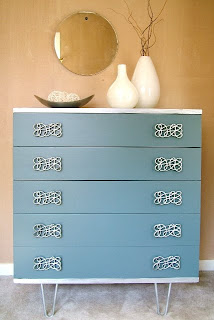
From Curlby
I love the idea of using various tones of the same color. I've seen this on other sites and am really into the idea of using a sample of each color on a paint swatch (that's what those things are called, right?). I think we'd go for blues or maybe yellows to match the decor, but I have a feeling that may be a little bold for my boyfriend's taste. And, while I think this idea would be great for the dresser, it would look a little funny on the nightstand, which only has two drawers.

From Refresh Restyle
I love this one for so many reasons. The Robin's Egg Blue on top (which you can't see much of from this angle) and the neutral brown make this a top contender for color choice alone. But, above all, I love that she used different, but still coordinating, knobs to really make her dresser unique.
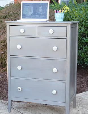
From Lucky Me Studios
This one is beautiful because it's simple. I also love it because I'm obsessed with the color gray. I find it to be the most interesting neutral, depending on the shade you use, and it also goes with everything. I also love this piece because of the knobs - she actually Modge Podged (don't think that's a verb...) old newspapers onto the existing knobs. Not only does it look unique, but it's a heck of a lot cheaper than buying the beautiful but expensive knobs from Anthropologie.

From Salvage Savvy
Ah. I am in love. I love the colors, I love the two-toned thing she's got going on, I love the legs, and most of all, I love the pulls. Those are pretty much the most beautiful pieces of drawer hardware I've ever seen. Unfortunately, she doesn't tell readers where she got them, so I can't copy her per se, but it does give me some other ideas in terms of how to make an otherwise boring piece (mine, not hers) look extra amazing.
So, readers, what do you all think? Which makeover should I go for? Or should I go for something completely different? I'll add pictures of the actual pieces of furniture when I get home, but until then, just imagine something that's equal parts boring and gross.
UPDATE: Got approval (slash he's decided to help me) from the boyfriend, and have already chosen a color scheme. Keep an eye out on Monday or Tuesday for the furniture makeover!
Monday, February 11, 2013
Burlap Matted Frame
As we all know, Valentine's Day is coming up this Thursday. My boyfriend and I aren't really into Valentine's Day; we usually just like to go to a movie or cook dinner together. This year, though, he has class until 9 PM on V-Day, so obviously, we won't be doing much that night (I like to sleep..a lot). While we're going away this weekend to his family's beach house in Rhode Island, I still wanted to make the actual 14th a little bit special.
Ethan (the boyfriend) has always wanted a flask, so, being the awesome girlfriend that I am, I got him a monogrammed flask that he can use for his whiskey or scotch or whatever it is people put in flasks. While I know he'll like the gift, I also wanted to get him something a little more meaningful. So, I'm giving him a gift "from" our dog, Olive. Stupid, I know, but I have turned into the crazy dog lady and I don't even care how insane this makes me look.
While I'll be outlining the Valentine's Day gift from the dog later this week, tonight I had to do some prep work to get the frame ready for whats going inside. Last week, on a trip to Ikea, I picked up this Ribba frame with room for a 4.75" square picture. While I could have gone larger, I didn't want to lose the mat, as I think it makes frames (and the pictures inside) look a little fancier. But, at the same time, the white mat bored me. So, I decided to jazz it up a bit with some burlap.
I love the way burlap looks - a little bit rustic, but still very clean. I think it adds some great dimension to something boring like a picture frame and I hoped it would really draw some interest to the piece.
All in all, this project took me about 15 minutes and $10 (for the frame). Everything else, I had on hand, and if you have some frames lying around, this could be absolutely free.
.jpg)
These were all the materials I needed: some burlap ribbon I had on hand from something I did over Christmas, a hot glue gun (and about 2 hot glue sticks), scissors, and of course, the mat. To start, I simply cut a piece of the ribbon that I knew would be at least as long as one side of the mat.

I applied some hot glue to the edges of the ribbon and simply pressed it down. I cut off and excess to make it as close to perfect as possible. Whenever I could, I simply wrapped the ribbon around the back of the mat to make it the best fit I could.

I continued this process...gluing and cutting as much as I needed to along the way.


After all the ribbon was laid down and glued on tight, I had to cut a bit more off until I had something that looked like this:

And of course, a nice view of the back, which was a little messier, but who cares! No one is going to see it anyways.

Then, all I did was stick it back in the frame and onto the photo ledge. While the frame is still empty for right now, I think it looks a million times better than the original.

Finding Nemo
This weekend I got a little off track. Instead of taking pictures of my living room as promised, my boyfriend and I spent the weekend snowed in thanks to the Blizzard of 2013 - or Nemo, as he was so interestingly named.
When my boyfriend and I moved to Boston almost two years ago from Washington DC (where we went to college), we both couldn't wait for our first New England winter in some time (we're both originally from the area - he from Connecticut and I from New Hampshire). Last year, though, was the weirdest, warmest winter ever (thanks, Global Warming) and we were so sad to never experience a true Boston snowstorm. So, last week when we heard Nemo was coming, we couldn't have been more excited.
According to the Weather Channel, Boston received a whopping 24.9 inches of snow - the fifth largest snowstorm in history! Needless to say, we were crazy excited and spent both Friday night during the storm and Saturday morning in its aftermath walking around the city and really getting into the snowy spirit.
One of the reasons we love our apartment so much is our neighborhood - the North End, and I think these pictures of the storm show exactly why we're so in love with both our hood and Boston in general.
.JPG)
.JPG)
.JPG)
.JPG)


When my boyfriend and I moved to Boston almost two years ago from Washington DC (where we went to college), we both couldn't wait for our first New England winter in some time (we're both originally from the area - he from Connecticut and I from New Hampshire). Last year, though, was the weirdest, warmest winter ever (thanks, Global Warming) and we were so sad to never experience a true Boston snowstorm. So, last week when we heard Nemo was coming, we couldn't have been more excited.
According to the Weather Channel, Boston received a whopping 24.9 inches of snow - the fifth largest snowstorm in history! Needless to say, we were crazy excited and spent both Friday night during the storm and Saturday morning in its aftermath walking around the city and really getting into the snowy spirit.
One of the reasons we love our apartment so much is our neighborhood - the North End, and I think these pictures of the storm show exactly why we're so in love with both our hood and Boston in general.
.JPG)
The boyfriend and dog running down Hanover St. Friday night - a street that is usually packed with cars and people
.JPG)
Olive trying to navigate the 2+ feet of snow outside our front door
.JPG)
Salem St. in the North End
.JPG)
Paul Revere statue and the Old North Church

Some poor people will have a very difficult time getting their cars out

Thank you to our awesome neighbor for snow blowing a path for all of us

Our car - next to a giant tower of snow drifts
All in all, we had a great weekend in the snow, and Olive had an even better time. We're looking forward to another storm soon, and I'm looking forward to getting our house back in working (and clean) order.
Pictures of the living room will be posted tonight, as I actually spent some of my Saturday rearranging a few key pieces.
Hope you all stayed warm and dry!
Wednesday, February 6, 2013
Urban Outfitters Home
While I've certainly detailed my love for Home Goods, it can be pretty unreliable in terms of what you will or won't be able to find. Because of that, I have a few online sites that I like to look at for inspiration or to buy something I can't seem to find at one of my regular in-person shopping locales. Not including Home Goods, I also love Target and Ikea, so as you can tell, I'm super high end. But let's be real - I'm 24 years old, I work at a non-profit...it's not like I'll be able afford Crate & Barrel or Pottery Barn anytime soon.
One home decor shop that has consistently surprised me (in a good way) is Urban Outfitters. While I'm trying to wean myself off buying clothes there (I feel like at 24 I should be wearing some more grown up things), they actually have a great selection of furniture pieces and little decorative accessories. Their furniture can be kind of expensive for my budget (and so is their bedding), but many times I've found affordable and cute (albeit perfect for my apartment) little extras.
A couple of weeks ago, while looking for something to put between the two chairs in my living room, I came across this table:

While $80 doesn't exactly scream OMG SUPER DEAL, it's not bad for a piece of furniture. With free shipping on top of that (only on orders over $50), I was convinced. And now, a few weeks later, I am ecstatic with my purchase. It fits in the room perfectly and it looks great - the distressed metal look is even better in person.
So today, while looking for a new rug for my kitchen (the existing one is a disgusting brown indoor/outdoor rug that is impossible to clean and is curling at the edges) and striking out on Overstock.com and West Elm, where everything was either too expensive or too hideous, I hit up Urban Outfitters once again. After a few minutes of browsing, I struck gold, and just ordered this little beauty for my kitchen. It's 2 x 3 feet, which is the exact size I was looking over, and at only $24 (plus shipping), I'd say it's a pretty good deal.

I'm excited for it to come and hoping it works out as well as the table has! Also while browsing, I came across this print that I am OBSESSED with.
I love, love, love maps as art, but alas, I can't think of where I could fit this 20 x 30 inch print, so it will have to wait.
Some other gems I've gathered from Urban Outfitters in the past include two of these acid etched letters (one N and one E - our initials) and this over-the-door hook for hanging towels in the bathroom. So far, I have been impressed with both the quality and durability of all these pieces, as well as the aesthetic. While everyone I know seems to wear the same clothes from Urban Outfitters, their apartment line hasn't caught on in the same way and you don't need to worry about seeing your goods in everyone else's apartments.
Just my two cents! Where do you all love to shop for home stuff online?
The Evolution of the Living Room
Last night, as I was taking pictures of my living room/kitchen area to upload here I realized it wouldn't make sense for me to show you just what the apartment looks like now. While it's by no means finished, it looks a million times better than it did when we first looked at the apartment and when we moved in. So, in order to really show you how far things have come, I figured I'd give you a tour of our little apartment over the last nine months.
About a year ago, we started looking for a new apartment. At the time, we lived in Brookline, right by Boston University, in a huge apartment building that was more like a college dorm than anything else. While the apartment was nice enough, had parking and was literally a block from a huge dog park, it just didn't do it for us. We had dreams of living in more historical and more happening areas of Boston, and after falling in love with the North End, we settled on finding somewhere there.
Our current apartment was the first and only place we looked at. My boyfriend went to see it one day without me (I was working) and then I went back with him a few days later to give it my OK. While I had seen pictures online (and I wasn't too impressed), I immediately liked the tiny little street it was on, and once inside, I loved the two-floor layout and the little quirks and charm the place had. The previous tenant was a single, male law student - and boy, could you tell. Prior to moving in, this is what the living room looked like:

.JPG)

I found the ivory and blue chair one day at Home Goods (if you couldn't tell, I'm kind of addicted to that place). I loved it (and it's $150 price tag) and immediately brought it home. While it looked great, it just didn't fill the space quite right. Along with the old fashioned coffee and end tables (relics from my parents old living room), the outdated lamp (another piece from my parents) and the empty spaces above the couch and television, I knew I had a lot of work left to do.

A few days after buying the first chair at Home Goods, my mom convinced me to go back and buy a second. Not only did it add an additional seating option, but it really balanced the look of the room. Along with a wicker wall storage unit and a huge mirror (both from, you guessed it, Home Goods!), I loved the way the place was coming along. Still, though, I knew I had to do something about the clunky and out of place tables.

About a year ago, we started looking for a new apartment. At the time, we lived in Brookline, right by Boston University, in a huge apartment building that was more like a college dorm than anything else. While the apartment was nice enough, had parking and was literally a block from a huge dog park, it just didn't do it for us. We had dreams of living in more historical and more happening areas of Boston, and after falling in love with the North End, we settled on finding somewhere there.
Our current apartment was the first and only place we looked at. My boyfriend went to see it one day without me (I was working) and then I went back with him a few days later to give it my OK. While I had seen pictures online (and I wasn't too impressed), I immediately liked the tiny little street it was on, and once inside, I loved the two-floor layout and the little quirks and charm the place had. The previous tenant was a single, male law student - and boy, could you tell. Prior to moving in, this is what the living room looked like:

Despite the oversized furniture and this hideous little makeshift table (which you actually can't see from this angle), we saw the potential in this little place. Combined with the roof deck and price ($175 less than our previous apartment), we were sold.
On May 1 of 2012, this is what we moved into - a beautifully empty room!
.JPG)
In this photo, you can see a bit more of what we liked - the hardwood floors and the huge windows (as well as my dog's favorite toy). Then came the actual moving in of the furniture, the purchasing of a few decorative accessories (including our rug - only $150 at Home Goods) and additional pieces of furniture. After about a month in the new place, this is what we had:


A few days after buying the first chair at Home Goods, my mom convinced me to go back and buy a second. Not only did it add an additional seating option, but it really balanced the look of the room. Along with a wicker wall storage unit and a huge mirror (both from, you guessed it, Home Goods!), I loved the way the place was coming along. Still, though, I knew I had to do something about the clunky and out of place tables.

This is a bit closer to what the place looks like now (don't mind the boyfriend's feet). We changed out the old coffee table for a trunk from Target, which was great, because it's smaller than your average coffee table and it adds storage (the closet space in this place is severely limited). I ordered a sheet of glass online, which fit perfectly, and now the coffee table/storage trunk is absolutely perfect. In addition, we purchased this kitchen cart from Ikea and made it into a cute little bar. Without a doubt, this is my boyfriend's favorite addition to the apartment.
This picture is from a few months ago, and at the time, I still needed a new end table for next to the couch, something to go between the two chairs and most of all, something to fill up that horrid white space above the TV. While I simply purchased some furniture to solve the first two problems, my boyfriend and I did a nice little project to complete that third area of need (more on that later this week!).
Tonight, I will actually post the photos of what our living room looks like now, and tomorrow, I'll be doing another tour - this time, I'll be detailing the evolution of our kitchen.
Let me know what you think!
Subscribe to:
Comments (Atom)